


Colours to make your living room cosy
Calm, snug, warm, serene. These are all words that describe how we want our living room to feel. As we move into autumn and the temperature outside starts to drop, now is a great time to turn our thoughts to creating a cosy living room where we can snuggle up and relax.
Whether your preference is for barely there colour in a minimalist scheme, a natural space with gentle shades or a vibrant palette with lots of pattern, the secret to creating a sense of warmth is to choose hues with a hint of red or yellow and add multiple layers of texture with soft furnishings and accessories.
Less is more
A monochrome scheme in a tight colour palette of off-whites and palest greys will create a tranquil feel as the lack of colour differentiation is less visually distracting. However, a white on white scheme can be tricky to pull off, particularly during the winter months when natural sunlight is reduced. To prevent your monochrome living room from feeling cold, choose shades with a hint of warm hues. A herringbone floor in a pale wood design will add both pattern and natural texture. Then add accents in darker shades and plenty of cosy cushions and throws.
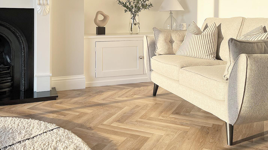
@Cumbrian_dormerbungalow featuring our small plank herringbone Pale Limed Oak. Also available in a full length plank gluedown format.
Keep it natural
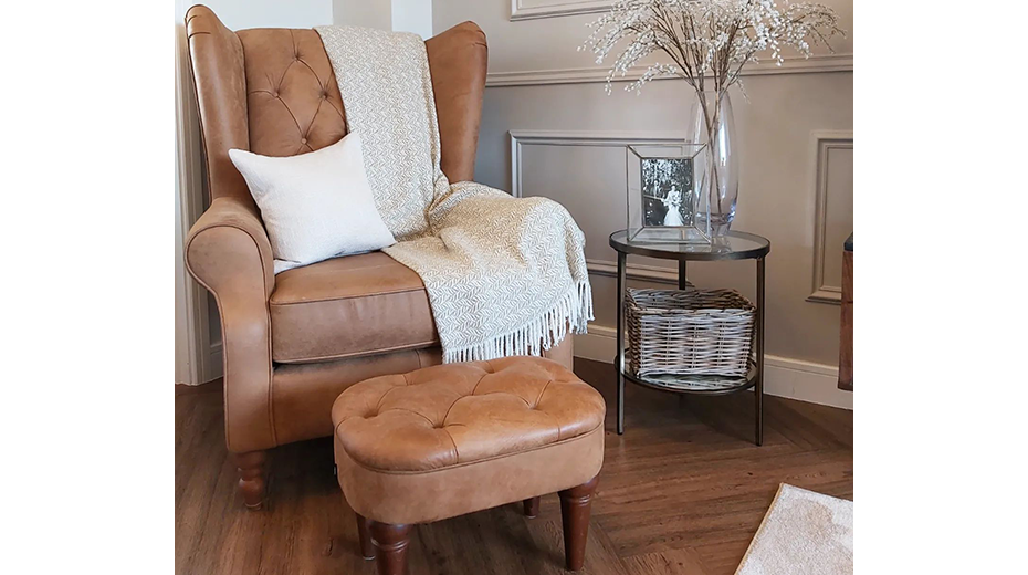
Spending time in nature is healing so it’s no surprise that we can recreate some of these feelings when we decorate in the colours we find in wild places. Think of mellow earthy colours with warm tones such as stone, ochre, cinnamon, sage or chocolate. Then add a mix of natural materials and patterns with tactile woven wall hangings, cushions and throws in humble fabrics such as raw linen and wool. Finally add a timeless wood design flooring such as oak.
@ Thedownhamdiary featuring Mid Limed Oak from our Knight Tile collection.
Complementary contrasts
With a grounding neutral base in off-white or grey and the warm natural tones of a wood design floor, you can add your favourite colours for a personalised space that truly reflects you and your family. Choose one main colour, for example a sofa in rich grey blue then add soft complementary shades such as grey, pink or green. To ensure that the end result is harmonious, simply make sure that the accent colours are in muted paler hues.
@athomewiththelindes featuring our Blond Oak parquet from our Art Select collection.
Colour drenching
If your room is small and doesn’t get much natural light you can still achieve a cocooning effect with a sense of drama by opting for a dark colour balanced with rich neutrals. Look for a deep shade with a warm base such as forest green, teal blue or heather and take this colour over walls, ceilings and woodwork. For the full colour drenching look add furniture in the same colour or, for a more subtle effect, opt for warm mid-tone brown or grey. Then complete this opulent look with antique gold accessories, atmospheric lighting and a rich wood design flooring such as distressed oak or reclaimed barnwood.
For more style inspiration, follow @karndean_uk on Instagram.