
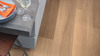
It’s an annual occurrence that has those of us in the interiors industry on the edge of our seat…the announcements of the upcoming “colors of the year!” Start your year off on-trend and with a refreshed color palette by incorporating these 2019 selections from paint and color experts into your home. Plus, we’ve included the Karndean Designfloors that complement each selection to take some of the guesswork out of your project! We've included selections across gluedown, loose lay and rigid core formats for each color.
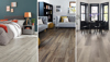
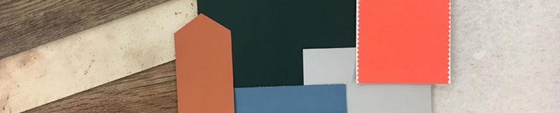
Living Coral, Pantone
Right image via Pinterest
This color, which Pantone describes as “vibrant, yet mellow…vivifying and effervescent,” will certainly make a splash in 2019 and in your home. The color is meant to be comforting and nurturing, empowering us to pursue all the things in life that are joyful and happy.
Vibrant colors like Living Coral are best used with thoughtful planning. For example, we don’t recommend painting an entire room in this color. Rather use it as an accent wall or in complementary décor elements like pillows or an accent rug. We've selected several floors with some pink undertones to best complement this shade, including Pearl Oak, Mid Limed Oak, Natural Oiled Oak and Burnet.
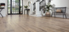
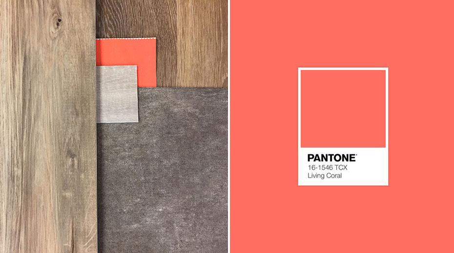
Cavern Clay, Sherwin Williams
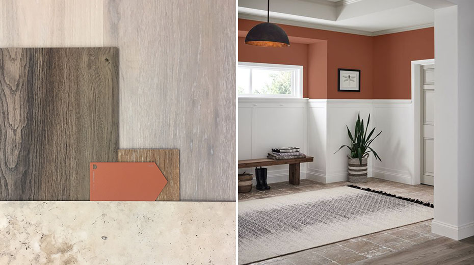
Right image via The Creativity Exchange
We’ve been seeing the trend towards the incorporation of natural, organic materials in commercial settings for the past couple of years, so we weren’t overly surprised by the selection of Cavern Clay, a warm terracotta shade. Inspired by elements midcentury modern style and the American Southwest, Sherwin Williams recommends pairing this color with greenery, bright tiles, leather or simple woodgrains.
In keeping with Sherwin Williams' recommendations of a simple woodgrain, our Honey Oak or Texas White Ash would strike a nice balance of a complementary tone with a simple grain. For a richer look in a wood floor, we like how this color looks with Hartford, and Washburn for an elegant stone pairing.
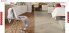
Blueprint, Behr
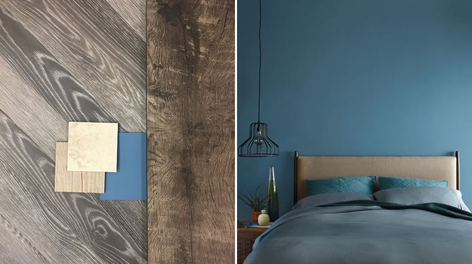
Right image via Behr
If warm color tones aren’t your style, not to worry, the soft muted blues of Behr’s Blueprint may better suit you. The spirit behind this color is in the name – Blueprint – used by architects and builders as a tool to bring design vision to life. It’s a color of transformation and possibility.
This color is pretty versatile, as it could be paired with both warm and cool tones and is the type of color you could paint an entire room with or use as simply an accent color. Because of this, there are numerous Karndean pairing possibilities, but some of our favorites are Country Oak, Limed Jute Oak, Reclaimed French Oak and Alderney.
Metropolitan, Benjamin Moore
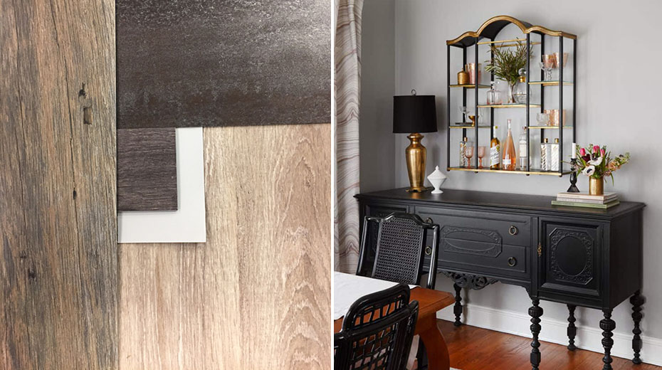
Right image via Centered by Design
Looking for a neutral paint color around which you can design your space? Look to Metropolitan by Benjamin Moore, a subtle light gray. Whether your style is traditional, minimalistic or Scandinavian-inspired, this may be the color for you!
This is another color for which there are many Karndean pairing possibilities. For a monotone look, pair it with Limed Coastal Oak, Reclaimed Redwood for a rustic look, Raven Oak for contemporary sophistication or Ferra for an industrial look with some metallic sheen.
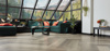
Night Watch, PPG Paints
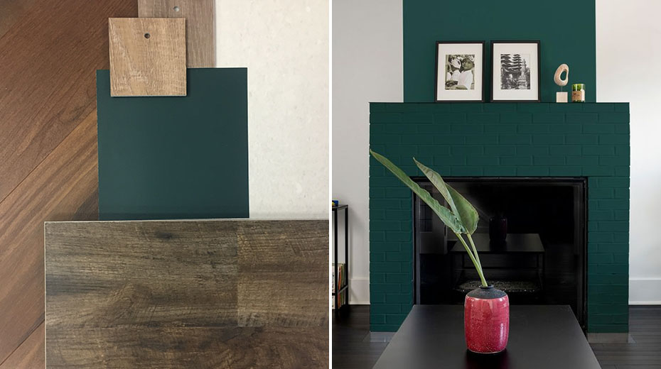
Right image via Apartment Therapy
If you want a sophisticated rich color to match your contemporary style, Night Watch may be the shade you seek. This black infused green has almost an inky look to it, allowing it to be used either as a neutral or an accent color. According to PPG, “Night Watch can make you feel healthy, grounded and calm, allowing other coordinating décor colors or interior plants to be showcased against its luxe backdrop.”
To match the luxe look of Night Watch, pair it with rich browns like Natural Walnut or Charred Weathered Pine, or if you prefer to lighten up the look Taupe Oak, Neutral Oak, or Honed Oyster Slate will complement it.
Whether you choose to use it as a paint color or an accent color, you certainly can't go wrong with incorporating any of these colors into your 2019 decor! If you do, share your Karndean product pairings with us on social media!